macOS is Unix, Sometimes Even the GUIs Entry 002
The beauty of understated design; E.G. in macOS Safari
04/22/2024
A macOS feature that I've seen documented or even mentioned exactly nowhere is the ability to scroll vertically with vi keys in Safari Reader Mode. Go ahead, open a text-focused webpage, press command-shift-R to enter Reader Mode, then press j to scroll down and k to scroll up. It even appears to avoid views that would expose only half of the text of paragraph.
We may never know if Apple isn't bragging about this one because of minimalism or their legendary communication issues, but vim addicts probably don't care: we habitually mash those keys when we forget we aren't in our favorite editor, so I'm surely not the first to notice. If you like this, open Terminal.app and run it; it's already installed.
Really unix-y things like this on macOS's non-unix applications are rarer every release cycle, so I am trying to be grateful.
macOS is Unix, Sometimes Even the GUIs Entry 001
Customizeable GUI
09/14/2023
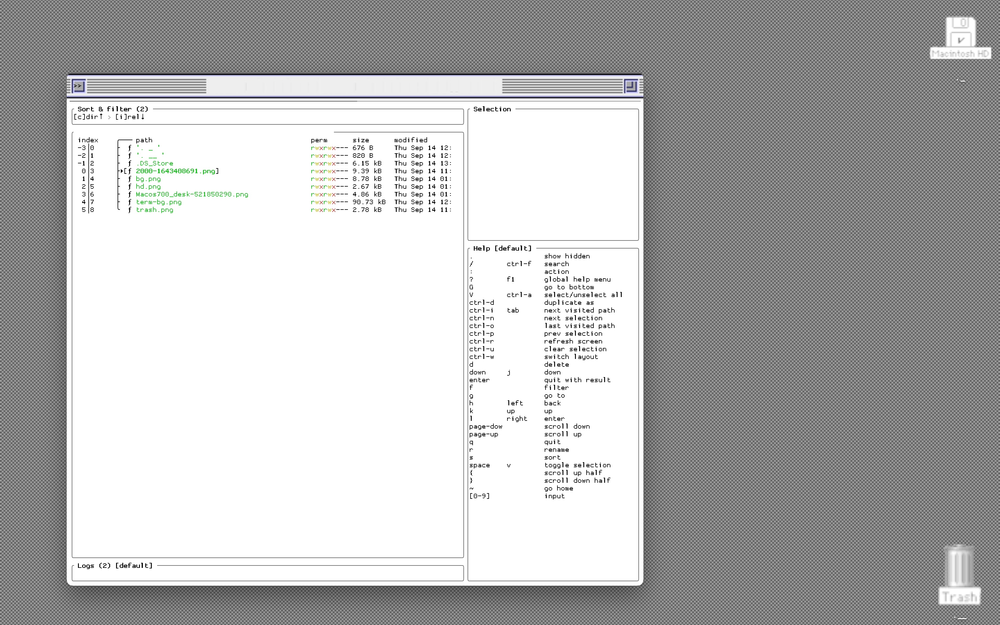
I made a desktop environment on my mac that uses visuals from macOS System 7. I need very little, a terminal and a cozy GUI to occaisionally drag and drop files. This means very little needed to change for my daily tools to all resemble a purer time of macOS unixes.
Once I cut all the PNGs I wanted, I just made some symlinks to some classic mac directories and changed the file icons. For the terminal, I chose an emulator that supports background images and put a tiny tmux window over the fake title bar.
Despite all the limitations of macOS's GUIs, enough things can be changed through its predicatable interface and FOSS apps. As in most situations where macOS gives way to a lot of customiation, the OS's tolerance to shell interaction is the major jailbreaker. By working and choosing to have few requirements, I get yet another small freedom.

Minimalism-Testing FOSS Entry 001
Krita
05/03/2023
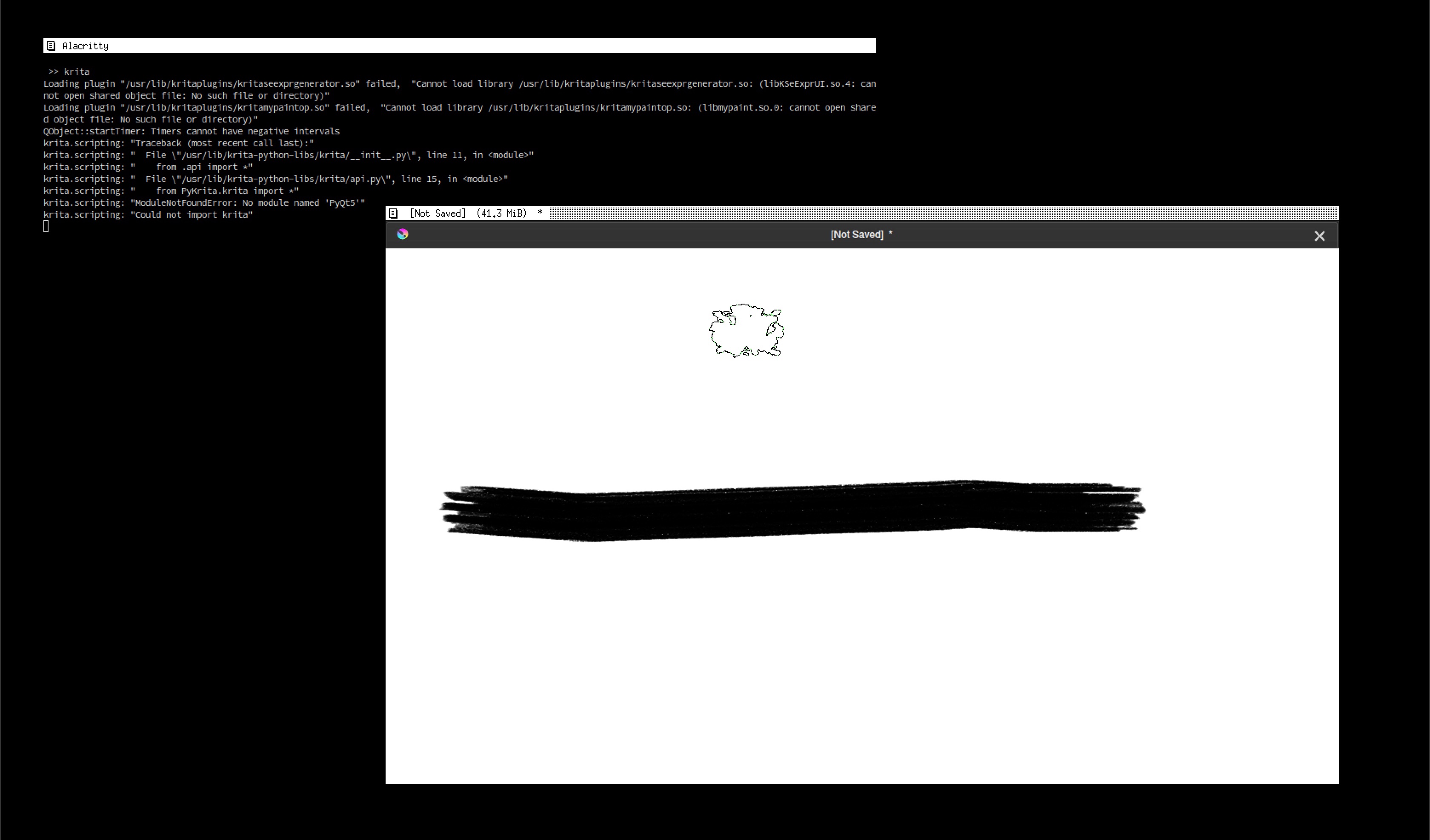
It will be easy for me to remember this efficient drawing program for the rare times I need it. It's a lot like GIMP: fully-featured, ugly, with a very configurable layout.
This was really convenient to install, so I must be late to the game to try it.
Thanks to the configurable layout, it's really easy to hide the mess of icons that get dumped onto the screen on first launch. Canvas-only mode focuses the experience espcially conveniently; pressing tab immediately switches to this view and then back to the main one. From canvas-only mode, right-clicking exposes a circular option selector that exposes all most task-relevant controls: tools, orientation, formatting. Really, the only things not available from the wheel in canvas-only mode are the things I wouldn't expect need while drawing: project and app settings, importing and exporting.

Interrupts vs Polling, Exceptions as a Model for Copmuting without Distraction
06/09/2018
Exceptions are instructions that interrupt the logical control flow. Processes use them to request services from the kernel. Operating systems use them to communicate with hardware and processes. Hardware uses them to indicate the status of a device.
There are two types of exceptions whose distinction is useful for using computers without distraction.
Interrupts
enable a device to signal when it needs attention.
Polling
repeatedly checks a device's status.
If a button is pressed on a keyboard, it will interrupt the currently executing instructions so that the input can be recorded. If the keyboard was unable to interrupt, the computer would have to poll, constantly check the keyboard for input. This would require a lot of extra instructions because the check for input has to be repeated. The system would run slower.
This is similar to how people use their phones. Users waste a lot of time if they have to check their phone to find out if there is a new message. Instead, they turn on notification sounds or vibrations to interrupt them when they receive a new message so that they can give their attention to their other tasks.
Many believe that getting notifications from your computers is a time-wasting distraction. This is likely because they receive notifications that weren't worth interrupting their other flows. In fact, creating notifications is more efficient than checking for new information because the attention is only shifted when there is something worth checking.
To make your work as efficient as an interrupt exception, turn off notifications that you don't need, experiment with new notifications that automatically show you information that you spend a lot of time looking for. Like a processor that just performs its given instructions, you can focus on your work without having to split your attention.
The explanation of technical subjects is based on Jim Skrenty's lectures at The University of Wisconsin.
Happy Birthday, Deiter Rams
05/20/2018
I share this birthday with the beautiful, focused, German industrial designer, Dieter Rams. Rams is known for the aggressive minimalism that make his products undistracting, simple to use. It's rarely thought of this way, but software development is industrial design: it is developed by a few people, then distributed to many more. His ten principles for good design perfectly outline an approach for designing anything minimally. They can be used to create an unobtrusive digital life.
Good design
1. is innovative.
- If you're using Rams' priciples to simplify your digital life, don't set out with the goal to innovate. The best changes you will make to the way you use computers will come from removing the unnecessary, which will usually encourage you to compute in innovative ways.
2. makes a product useful 3. is aesthetic.
- These two are useful for getting rid of digital clutter if you recall what Morris said. "Have nothing in your houses that you do not know to be useful, or believe to be beautiful."
4. makes a product understandable.
- Simplifying your digital life is an antidote for the overwhelm that most experience when considering how highly abstracted simulations like video games are created by altering the alignment of electrons. Understand what you use.
5. is unobtrusive
- This describes the main goal in designing zen-compatable computer systems. Remove an app from your phone if it distracts you; abstract a feature if it confuses your program's users; replace your big screen with a smaller one if you spend too much time plugged in.
6. is honest
- Don't use or design computer systems that the user can't trust.
7. is long-lasting
- Avoid the trendy, fashionable. Use systems that have been tested by time.
8. is thorough down to the last detail
9. is environmentally friendly
10. is as little design as possible
- This is the only principle worth remembering. Make your digital life "less but better." Edit until only the things you need or love remain.
Reaching Flow with Command Line Interfaces
05/10/2018
Graphical User Interface
(GUI) a human-computer interface used by controlling visual image representations of digital objects, often with a pointer or touchscreen
Command Line Interface
(CLI) a human-computer interface used by typing commands into a terminal
Being accustomed to only interacting with computers using GUIs will make most wonder why anyone would use the command line. After all, nearly all modern tasks, even software development ones, can be done with a GUI. GUIs enable unexperienced users to be able to do complex computing tasks intuitively.
What the command line has that most GUIs don't is
Ergonomics
Command Line interfaces are often preferred for their physical ergonomics. This lowers physical requirements that control how the computer can be used. Because the user does not need the mouse, they can use the computer in more confined spaces, save time not moving their hand to the mouse.
More importantly, the command line makes your workflow more ergonomic. Files with known locations can be accessed in a single action. Total customization allows you to automate common tasks and modify tools to fit the tasks for which they are used.
These ergonomics move the computer interaction process closer to pure thought. Without distractions, command line interface users will not only be able to act more directly, but think more directly.
The Fear of Missing Out Online
Subscriptions are Better than Surfing
04/11/2018
There is a conflict between the value of staying informed on news relevant to one's passions and the value of freedom from compulsions to explore the infinite unknown of interesting media. Many call this presence-destroying compulsion "the fear of missing out."
Surfing the web has been
- the source of inspiration for so many of my best projects,
- my introduction to artists who I think about everyday,
- a way of keeping informed about distant, dear friends' life events,
- how I hear about most of my favorite books.
I cannot begin to explain how the media I consume while web surfing have enriched my life.
The problem is that the power of this inspiration-spitting machine cannot be sustained by this link-following, multiple-feed-checking, internet rabbit hole technique. Each source of inspiration probably links to many other websites of interest, each of which probably do the same. You are so busy sorting through short-form media that you can't savor the long-form. What could be the point of seeking inspiration if it consumes all the time needed to act on inspiration?
The Solution
This is how you convert your media consumption from constant phone checking to a well-curated list of everything that interests you, nothing that doesn't and only takes ten minutes per day to check.
-
Pick a single feed. Email is best.
- You only want to have to check one list to find everything relevant to you or you will once again have to remember every news source you like. Looking for this news is what causes distraction. Email is great because you likely already have to check it for personal communications. You can still do this using inbox filters or separate email addresses. All that matters is that there is one feed or inbox that combines all of your email addresses, subscriptions, mailing lists.
-
Go through your browser history.
- Look at every website that you recently viewed. Note all the ones that provided a new idea, you loved, inspired you, made you add something to your reading/to-watch list, anything you want more of. If the inspiration came from an app, note the app's website and delete it from your device. Blogs written/curated by people who share your passions are most valuable. They understand why you like what you like and are therefore able to pick only the best of the best media.
-
Find a way to send the selected media to your inbox.
- Go to each website and look for a mailing list to which you can add your email address. Youtube vloggers are valuable for the same reason as written bloggers. They often have mailing lists on their personal websites. You can edit your social media notifications so you only are notified about updates from your closest friends. You can mute social media "friends" with whom you are obliged to have a public status, but whose content does not interest. IFTTT is useful for linking to trickier news sources, like RSS feeds.
-
"Always be iterating."
- Whenever you find something that you want more of, subscribe. If a mailing list has not provided anything interesting enough for you to read for the past three releases, unsubscribe.
By the time you are done, you might be receiving everything you found by surfing. This is okay. You now have a centralized way to edit your media consumption. Seeing all your media in a glance allows you to sort the mildly interesting from the life-enriching. This solution does not mean you should never surf the web again, its just no longer necessary in order to get the media you love. If you don't surf the web, you can now rest assured your most important news is in your inbox.
Introduction
04/09/2018
This is Zen Computing
Computers save you an enormous amount of time. Then they waste... the same amount of time that you saved...
- Ted Deakin's mother
This collection of notes serves two purposes.
- You can learn to use computers as life-enriching tools, not compulsive traps.
- You can learn to use computers for creation, free thought, not as Orwellian nightmare machines.
Definition
computer: a non-biologically-living object able to compute
e.g.
- a laptop
- a mobile phone
- a desktop workstation
- a Raspberry Pi
- a smart watch
- the Terminator
- a fucking Furby


